Most are built from the inside out: they reflect how the organization thinks about itself, not how their communities want them to show up. They’re serving multiple audiences at once, with differing, sometimes conflicting, priorities.
It’s a category we follow closely. The best ones recognize their website for what it is: an owned platform and a chance to be the clearest, most honest version of themselves online. They show their priorities rather than just stating them, and they meet audience needs with intention.
Here are ten ways the best foundation websites are getting it right.
Show, Don’t Tell
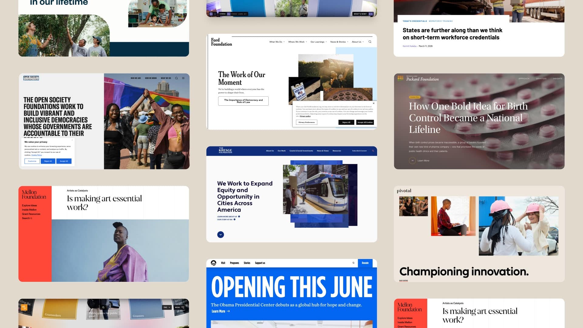
Many foundations tell you about their impact. The Robert Wood Johnson Foundation shows you what it looks like. Their grantee stories read like journalism: authentic narratives about real people. You come away understanding not just what was funded, but why it mattered.
Explain Your “Why”
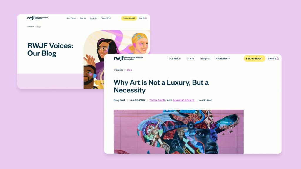
Many foundations list their focus areas and leave it there. The Ford Foundation goes further. They explain the reasoning and strategy behind each priority, whether that’s disability rights, the future of workers, or climate justice. The difference between a foundation that lists what it funds and one that explains why is the difference between a website that informs and one that builds trust.
Be Direct
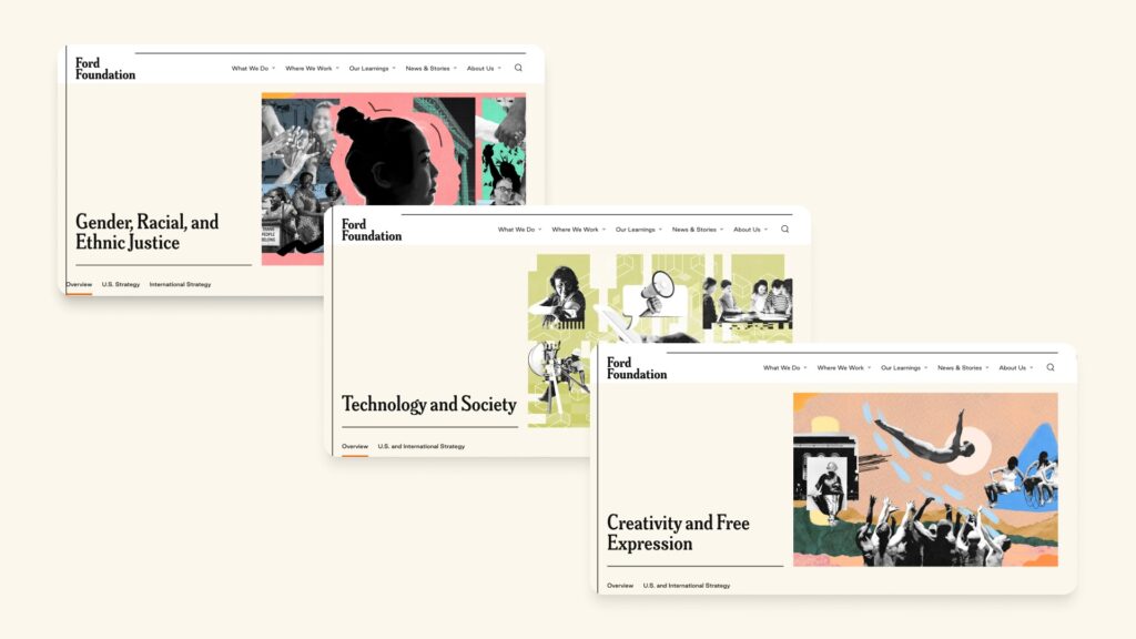
The best foundation sites help prospective grantees understand opportunities and alignment quickly. The Kresge Foundation does that. They’re upfront about what they fund, what they don’t, and what the process looks like. No ambiguity, no reading between the lines.
Own Your Voice
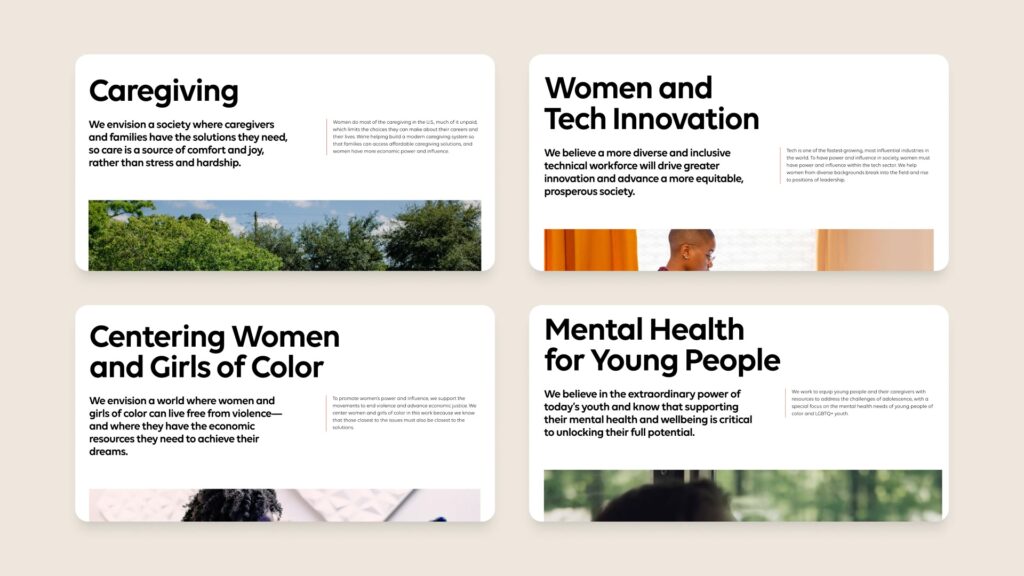
Content is everywhere. Yet, distinct voices are rare. Pivotal’s site stands out because it has a specific and unmistakable point of view. It doesn’t hedge or generalize. It communicates their funding priorities with clarity and conviction.
Design With Intent
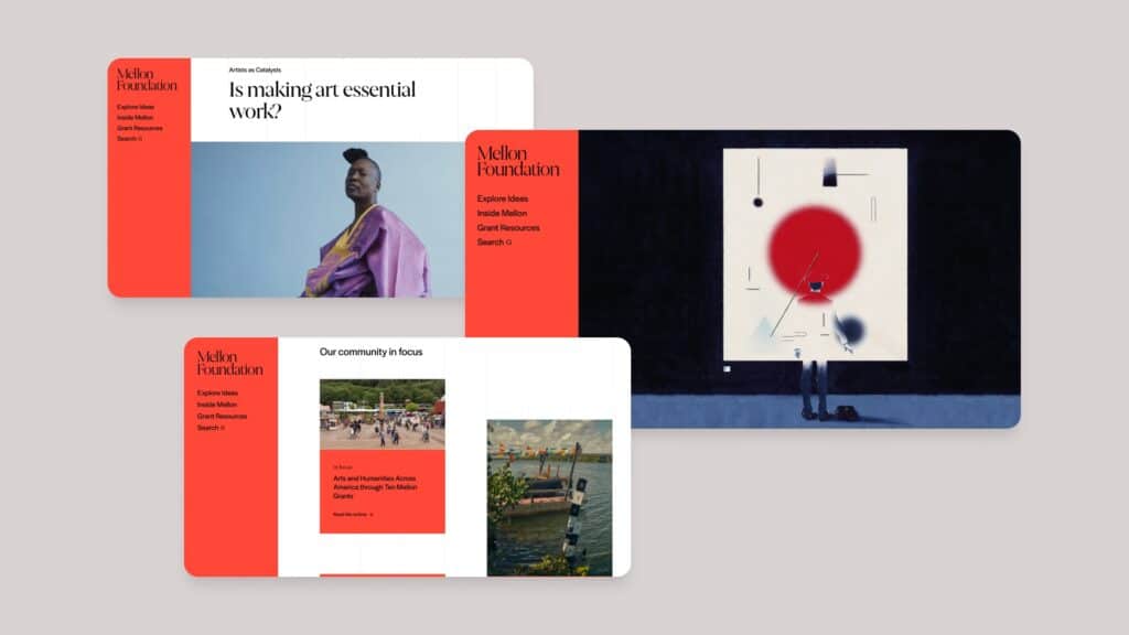
At the Mellon Foundation, design does real work. Full-bleed photography, generous white space, and considered typography aren’t decorative choices; they’re intentional ones. For a foundation built on the arts and humanities, the visual language doesn’t just support the mission; it reflects it.
Be Transparent
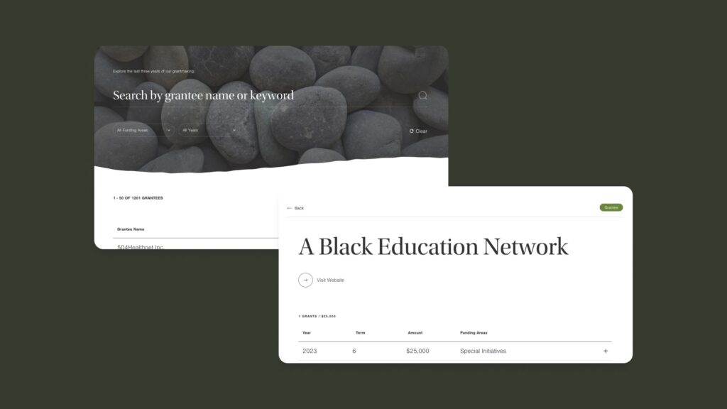
The Packard Foundation publishes a fully searchable grants database. For grantseekers trying to understand funding patterns, it’s enormously practical. For the foundation, it signals a commitment to transparency. Keeping the list updated signals conviction in times of political scrutiny.
Put People First
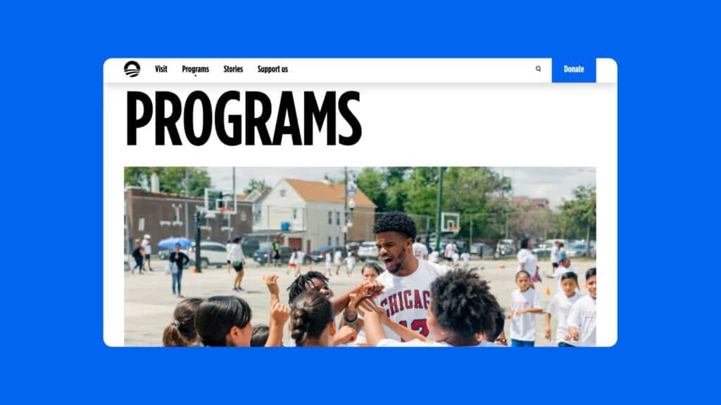
The Obama Foundation doesn’t tuck its leadership away in an About section. Their presence runs through the whole site, shaping the mission framing, the program storytelling, and the overall point of view. It feels human rather than institutional. Foundations are built on conviction, and the best websites make sure visitors never lose sight of the people behind it.
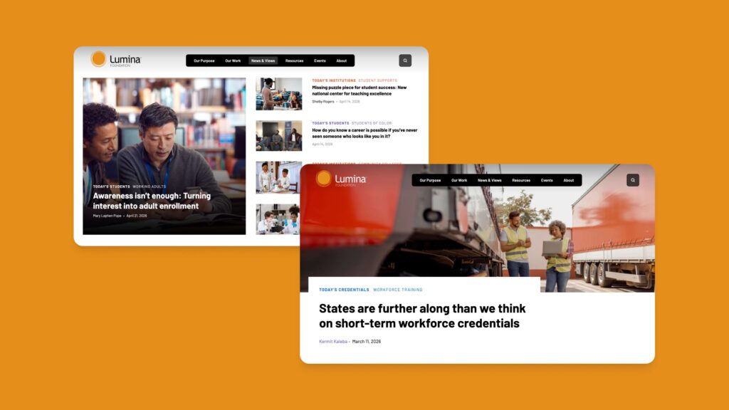
Publish Your Perspectives
Lumina Foundation treats its website like a publishing platform. Staff contributors write with authority on the issues they work on every day: AI in higher education, credential value, and equity in learning. The result is a News & Views section worth returning to. Foundations sitting on that kind of expertise and not publishing it are missing a real opportunity to shape the conversation on the issues that matter most.
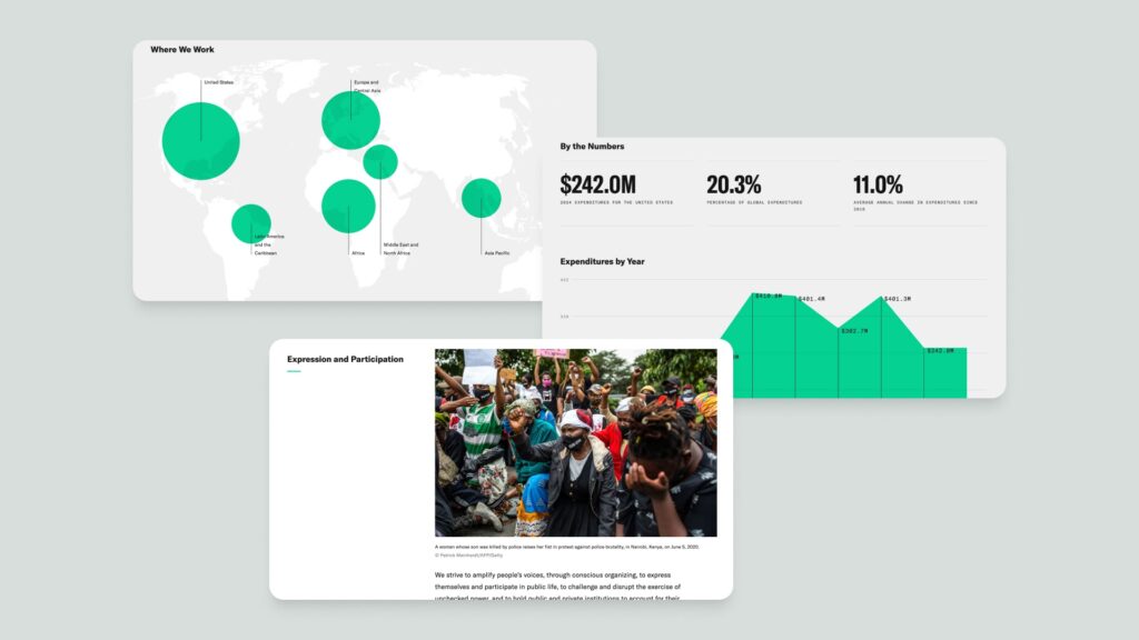
Make Complexity Feel Simple
Operating across more than 100 countries on deeply complex issues, the Open Society Foundations’ website could easily overwhelm. Intuitive navigation and clear audience pathways make a sprawling—- organization with nuanced priorities easy to understand. That balance is harder to achieve than it looks.
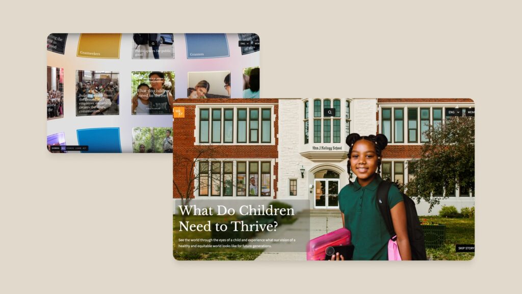
Build Momentum
The W.K. Kellogg Foundation treats their website as a rallying point, not a reporting mechanism. The framing around what children need to thrive, and the centrality of racial equity and racial healing, isn’t just program description; it’s a call to action.
In Conclusion
None of these foundations got here the same way. But they all made the same decision. Someone decided the website mattered and invested accordingly. At Visceral, we work with foundations ready to make that leap. If you’re thinking about a redesign, we’d love to talk.