Making sure that your website is accessible to all users, including those with vision, hearing, or motor skills impairments is an important consideration.
We’ve written before about what accessibility standards exist, why they’re important, and how they’re changing. We also work closely with our clients on accessibility and digital inclusion when we create new websites to make sure that they’re designed and coded correctly. But that’s only half of the story.
Websites are ever-changing communications tools and we see engagement flourish when content is updated and added frequently. So, what do you need to know as a content creator or website administrator to make sure that your website stays accessible when you add new content to it? Here are five useful tips to keep in mind when creating content for your site.
1. Never refer to a color as a directive to users
For example, “Click the blue button to register”. Some users might not be able to see the button. Others might be able to see it but have color blindness that makes it hard to distinguish the button from other buttons of different colors.
2. Never refer to the location as a directive to users
For example, “Click the button in the sidebar”. Users with visual impairments may not be able to make the connection from your direction to where the item is actually located on the page.
3. Use captions and/or transcripts for media elements
The presence of video and audio on the web has increased dramatically in recent years, creating an obstacle for those with hearing impairments. If you choose to use these mediums, make sure that you’re providing alternatives for users with disabilities. Closed captions are the preferred method for video (platforms like YouTube have functionality built in that can help facilitate this) but a simple text transcript will work as well.
4. Use descriptive link text
Links from one page to another are the backbone of the web itself, but what can seem intuitive to typical users can pose problems for those with disabilities.
Consider this image of a common promotional area. There are 3 calls to action, all with a link to learn more.
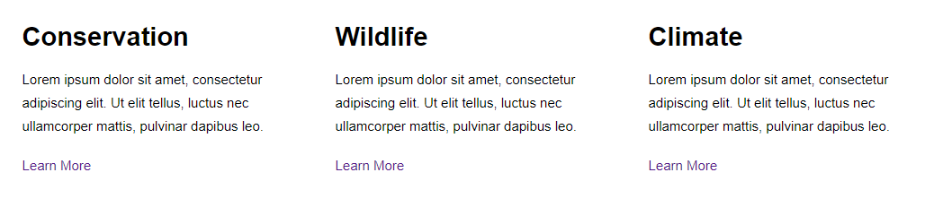
However, screen reader systems can often read links out of context so in this case, a user might hear 3 links that all say “Learn More” but that go to three very different places. A better option is to be descriptive in the link text itself.
Consider this alternative
Each link contains relevant keywords so that it makes sense even when separated from its surrounding elements.
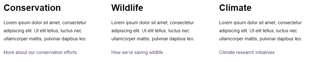
Always be as descriptive as possible with your link text.
Bonus: Search engines use the text within links to associate keywords with the links themselves, so this is beneficial for SEO as well.
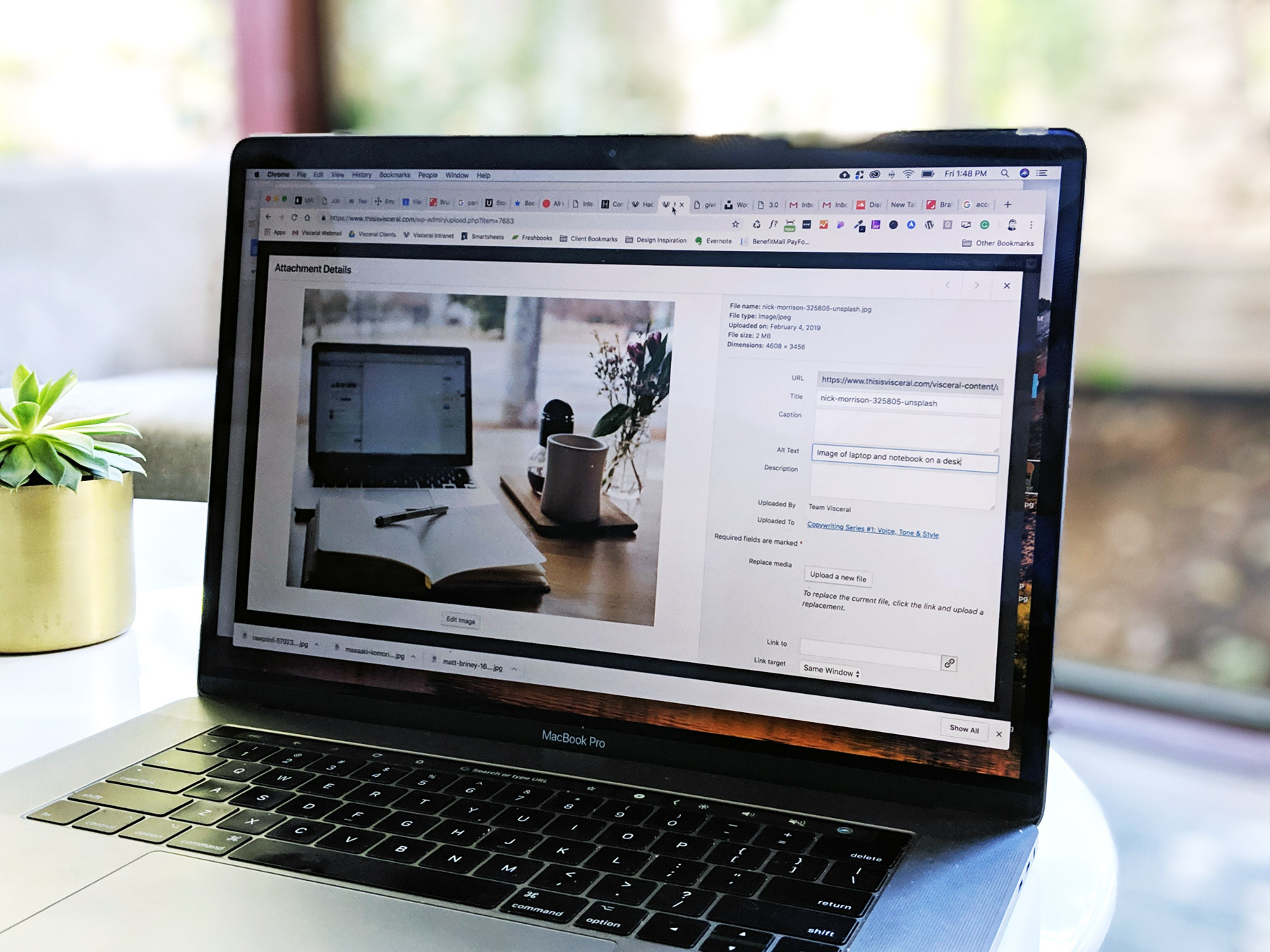
5. Image Alt Text
Adding “Alt Text” to images allows screen readers to communicate the content of the image by reading this text aloud to users with vision impairments. Fortunately, WordPress makes this easy, which is one of the many reasons we love it.
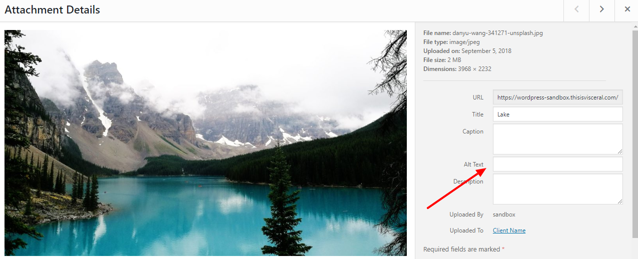
This photograph in the WordPress media library shows the Alt Text field as empty. This is actually appropriate in a lot of situations. On the modern web, many images are used purely for aesthetic purposes so the extra descriptive text is unnecessary.
This one, on the other hand, contains the relevant text that would be lost to a user who isn’t able to see the image.
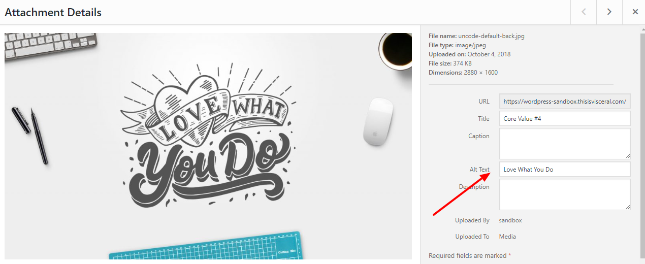
The general rule here is that anytime an image conveys something that is not otherwise conveyed in the content, make sure the Alt Text conveys the same meaning.
Often, the easiest way to determine the best approach for users with vision impairments is to close your eyes and imagine how the site would be read to you.
For example:
Should you put the name “John Smith” in the Alt Text of his bio page headshot image?
What other content is next to that image? Likely his name and title.
A screen reader would read that as:
John Smith (Image Alt Text)
John Smith, Executive Director (Page Content)
You can see that in this case, the Alt Text would be redundant so a blank Alt Text is actually preferable. By closing your eyes and putting yourself in the user’s mindset, you can often get a clear picture of the appropriate choice to make.
Conclusion
Keeping these tips in mind when you’re creating new content for your website can ensure that your new posts and pages are accessible to the widest range of users possible. As always, if you have any questions about this, contact us. We’re always happy to chat.