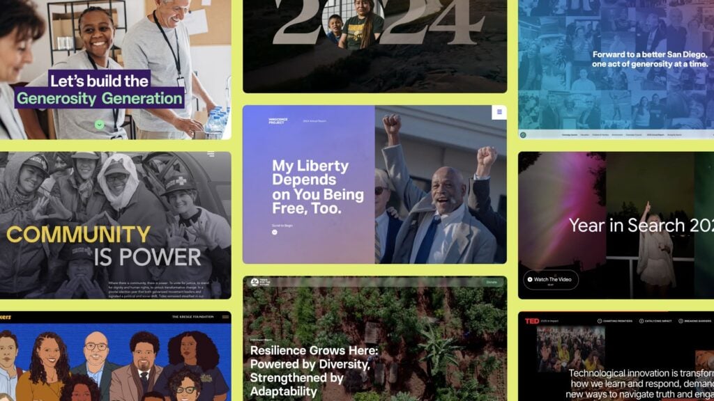
Policy organizations like think tanks, research institutes, and advocacy groups work on some of the most consequential problems of our time. The research they do is rigorous, and the recommendations they make are evidence-based. The stakes of getting that work into the right hands couldn’t be higher.
But even the strongest research doesn’t automatically translate to a great website. Too often, policy sites serve as a repository for everything, with no clear signal of the organization’s priorities or what’s urgent right now. Equally bad is a site that signals amateur when the work behind it is anything but.
We’ve studied what the best policy organizations are doing and why it works. A few patterns keep showing up:
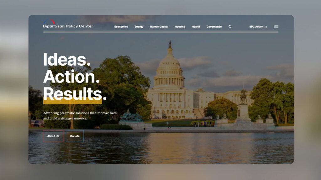
Bipartisan Policy Center’s homepage puts policy priorities front and center, organized by issue area so the right research reaches the right reader immediately.
They Make It Effortless to Find What Matters
A congressional staffer shouldn’t have to dig through five layers of navigation to locate a relevant brief. A journalist on deadline shouldn’t land on a homepage and struggle to find what’s most recent and relevant. Too often, organizations present their content in ways that align with their internal structure rather than users’ needs.
The best policy websites are designed with intention, around their audience’s needs. They surface recent content first, especially on emerging issues; their policy priorities are legible from the start, and the path from landing to finding is short and intentional.
Bipartisan Policy Center’s homepage puts policy priorities front and center, organized by issue area so the right research reaches the right reader immediately.
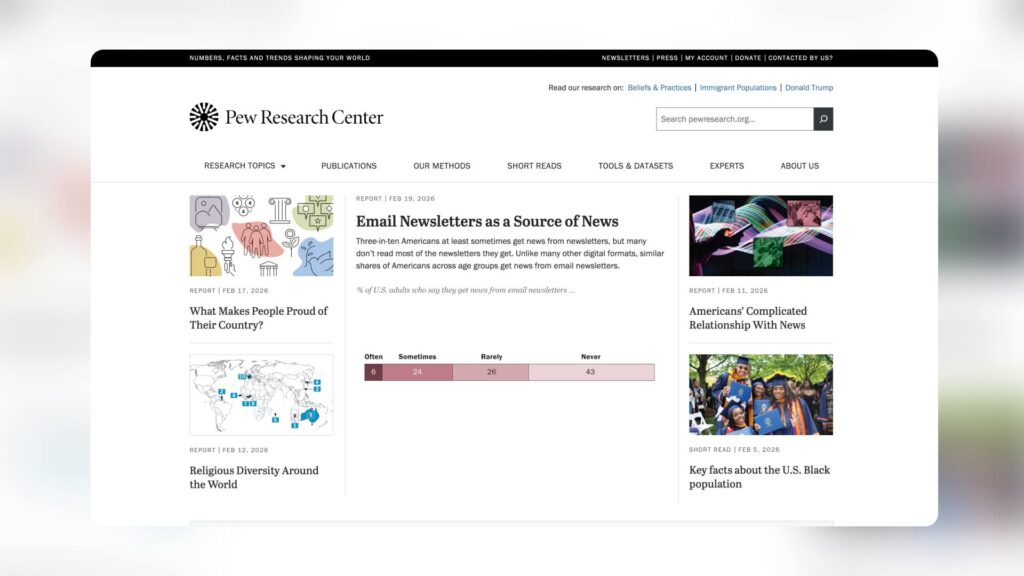
Pew Research Center leads with conclusions. Data-heavy research is presented with editorial clarity that makes findings accessible to specialists and generalists alike.
They Translate Complexity into Clarity
Policy work is inherently complex. The organizations doing it well have spent years developing nuanced positions on deep, systemic issues. There’s a common tendency to convey that complexity as a proxy for credibility. The result is dense, jargon-heavy websites.
The best policy websites understand something fundamental: the job of the site is to guide readers into the deeper work, not overwhelm them with it. Brief report descriptions, TLDR-style summaries, and scannable data visualizations do the interpretive heavy lifting, drawing readers in before they’ve committed to a single full sentence.
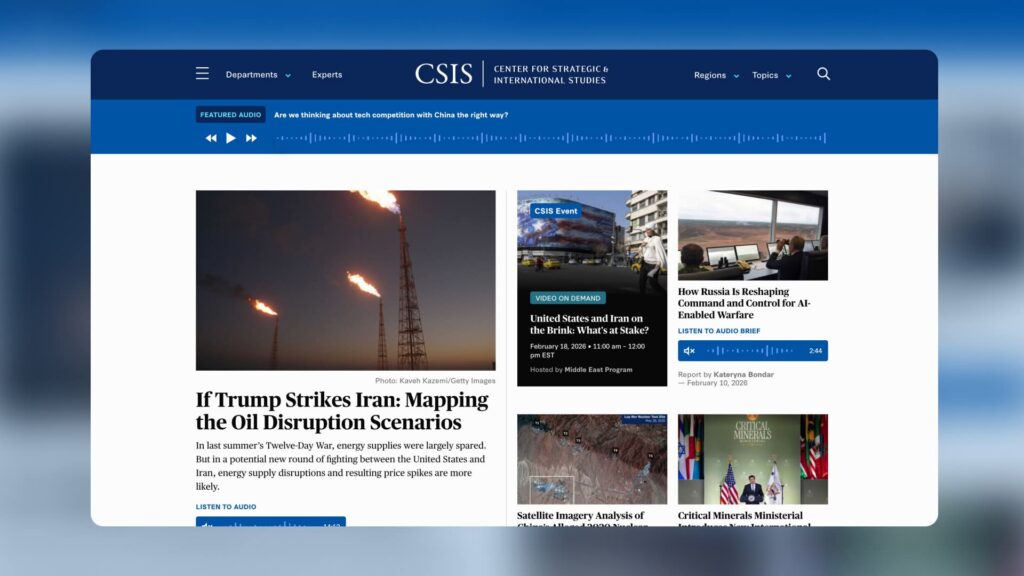
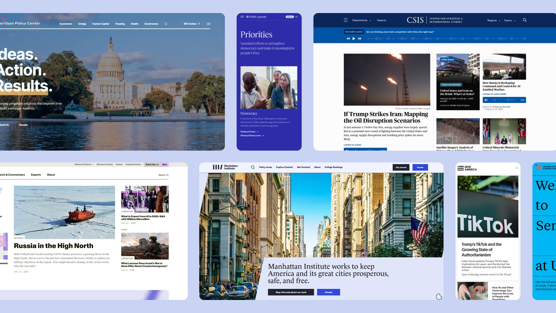
Center for Strategic & International Studies (CSIS) communicates authority through restraint. The design is pragmatic and unadorned, letting the weight of the research speak for itself.
They Design for Credibility
Credibility on a policy website isn’t announced. It’s felt. Typography, spacing, image quality, and a consistent visual language are individually minor, but together they create a perception of quality that directly transfers to the work itself. A well-designed site signals an organization that is experienced and trustworthy.
The best policy websites are pragmatic by design. Free of flourish and ornamentation, they communicate something important to the people they’re built for: we respect your time, and we’re confident enough in our work to let it stand on its own.
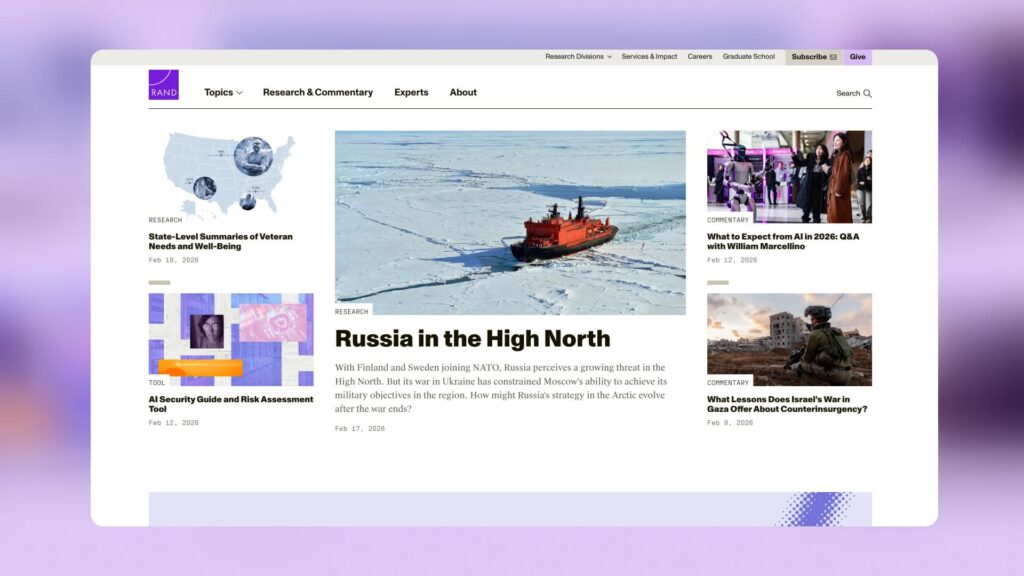
RAND is built around influence, not just information. From newsletters to interactive tools, every element is designed to move the work into active circulation.
They Move People to Act
Great policy websites aren’t passive archives. They exist to advance influence, and the best ones are built with that goal embedded at every touch-point: a download, a newsletter subscription, a media inquiry, a share. The calls to action are clear without being pushy, and the content itself motivates engagement.
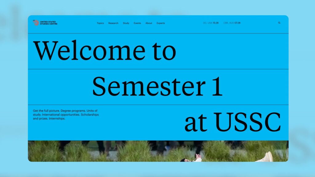
United States Studies Centre (USSC) demonstrates how a research institution can build genuine audience relationships — through degree programs, public events, and a regular podcast that keeps the conversation going.
They Build Connections
A single visit is almost never the goal. The best policy organizations have built ongoing relationships with their audiences through newsletters, event invitations, regular publications, and timely commentary on emerging issues. Their websites are the hub of a content ecosystem, not a standalone destination.

Center for American Progress’ (CAP) homepage operates like a publication, surfacing the most urgent policy issues of the moment with the weight of a serious research institution behind them.
They Think Like Publishers
The best policy websites feel like editorial platforms. The most pressing, emerging issues are surfaced front and center. The homepage reflects what’s happening in the world right now, and it changes accordingly.
The organizations doing this well have taken cues from the best news and media websites. Content is prioritized editorially, not organizationally. What makes the best policy websites distinct from a news site is that the editorial energy is anchored by institutional weight. The freshness of the content and the authority of the research reinforce each other.
In Conclusion
The organizations getting this right didn’t arrive there by accident. It takes strategic intent, editorial discipline, and a willingness to invest in the platform as seriously as the work itself.
If that’s a conversation your organization is ready to have, we’d love to be in it.