It’s that time of the year. The air is getting cooler, days are getting shorter, and the hustle and bustle of the holiday season is right around the corner. It’s also that time of the year when organizations reflect on all they accomplished during the year.
Annual reports have long been a way for organizations to highlight the impact of their work and showcase the activities they had throughout the year. More organizations are opting for web-based or digital reports and for good reasons:
- They’re dynamic – With digital reports, content is designed to be more interactive, visually interesting and more user friendly, and will keep people engaged from beginning to end.
- They’re measurable – There is a lot of analytics that can be gathered from a digital report that can inform how your upcoming reports are tailored. Things like what types of content your audiences are most interested in, how they came across the report, and many other useful details.
- They’re sustainable – Keep your environmental footprint lower and opt for a digital report instead of a printed one. Since it’s built on the web, it’s a simple click away to edit content in the case that an update is needed.
- They’re easy to share – Reach a wider audience and target specific groups of people from different locations using data gathered from web analytics. Web-based reports also make it easier for people to find through search engines, promotion on social media and through email newsletters.
- They’re responsive – With increased mobile usage, reports that are optimized for mobile, desktop and everything in between increases audience engagement.
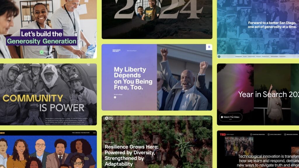
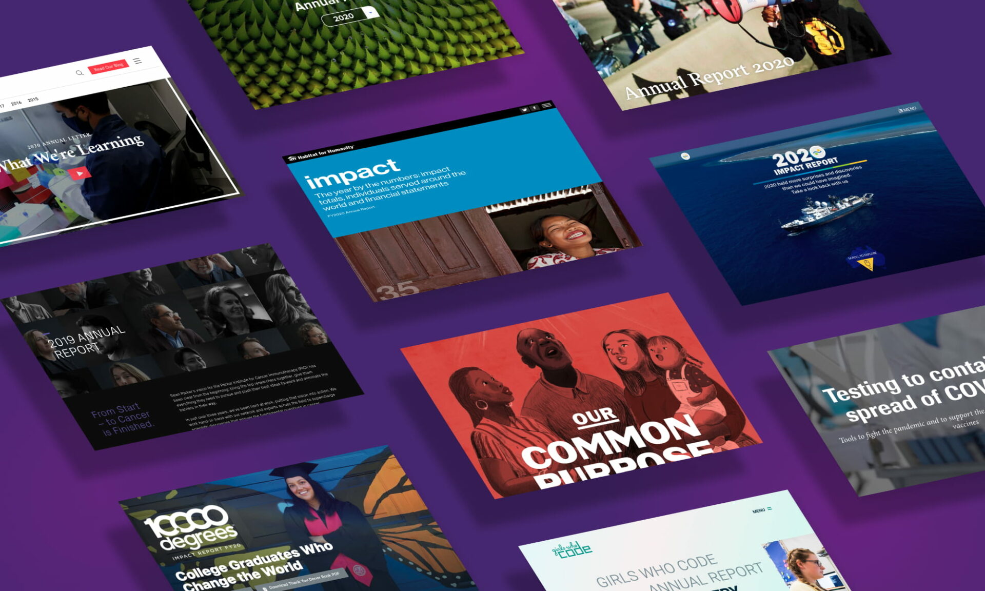
Ready to be inspired? Check out these examples of annual reports that make a case to go digital:
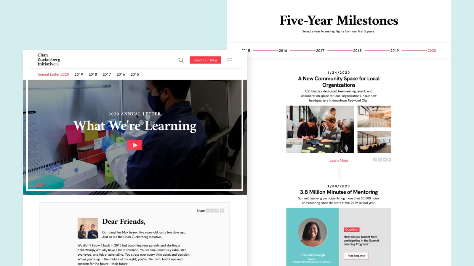
Chan Zuckerberg Initiative
This 2020 Annual Letter is a strong example of presenting milestones in bite-sized chunks: some displayed as Q & As, others as videos, photos or infographics that help tell the story of their achievements. We also love that sharing everything on social media is just a click away.
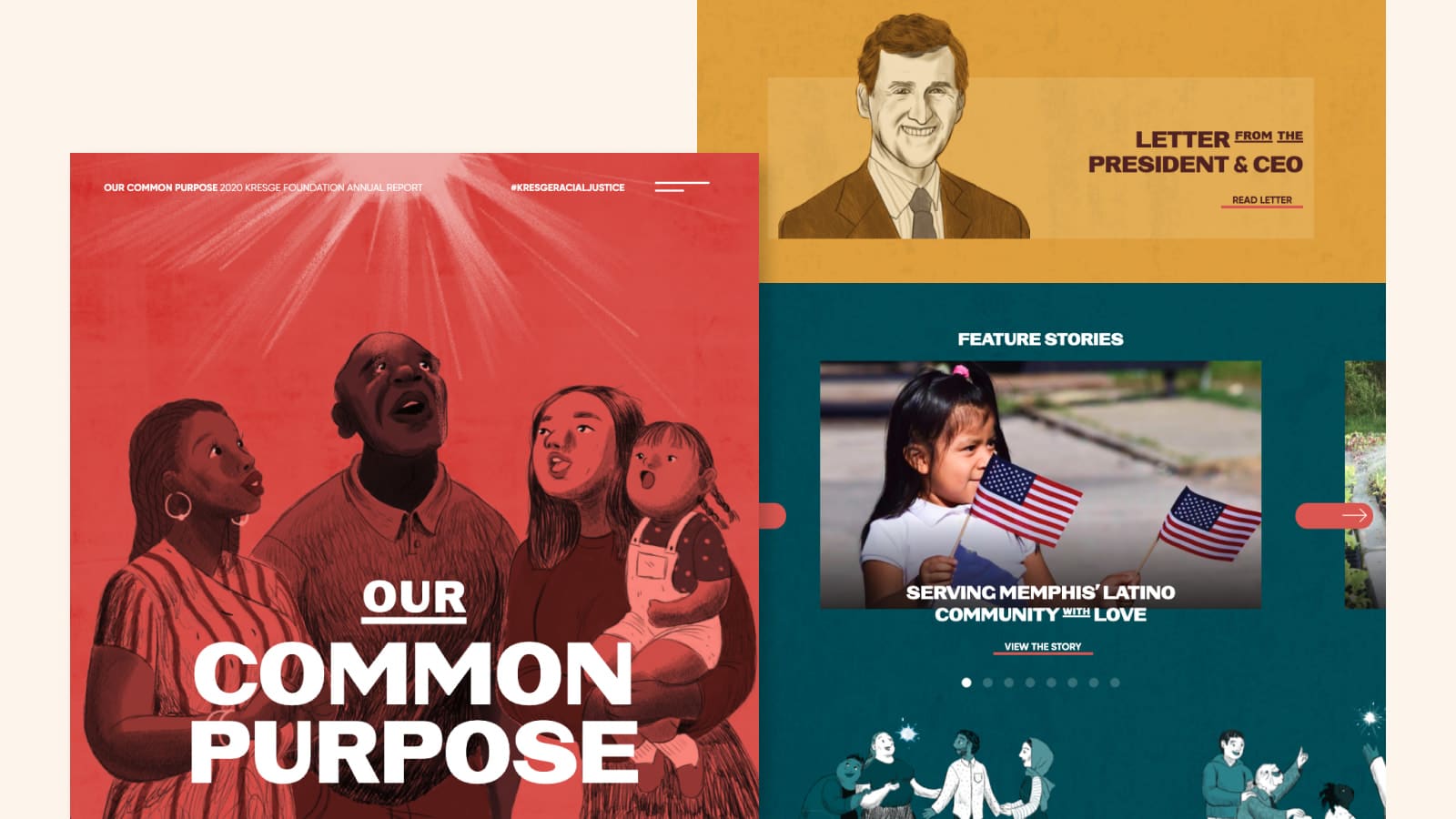
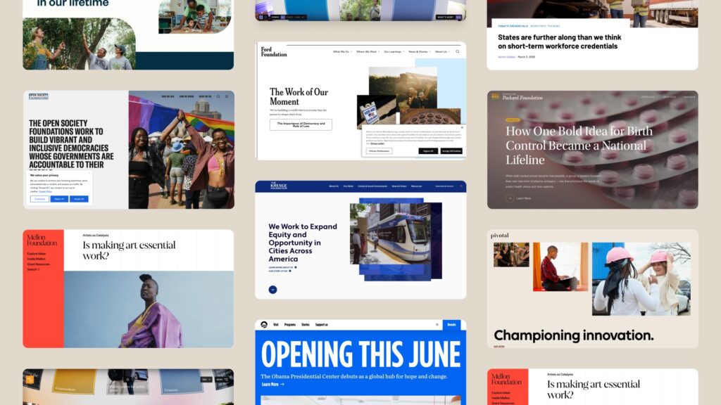
Kresge Foundation
Talk about a report that really brings their annual theme and mission to life! Visceral collaborated with a group of diverse artists to create a site featuring stories of hope. Complemented by hand drawn illustrations, colorful layouts, and playful animations, the report creates an overwhelming sense of optimism for the future by showcasing Kresge’s fight against racial injustices.
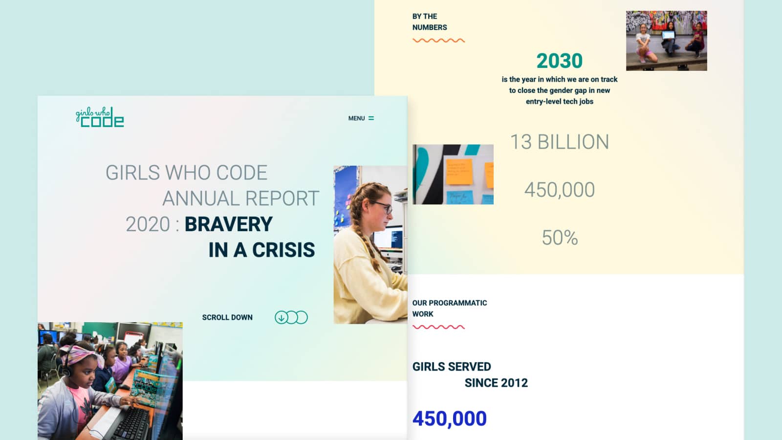
Girls Who Code
Girls Who Code did an exceptional job of visualizing the work they’ve done through the combination of infographics, animation, photography, layout, and color, keeping viewers engaged from beginning to end.
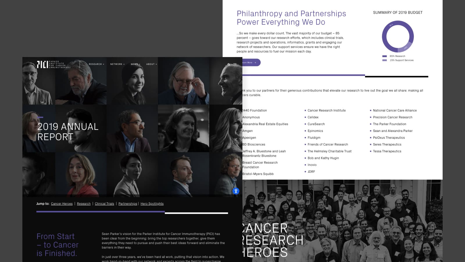
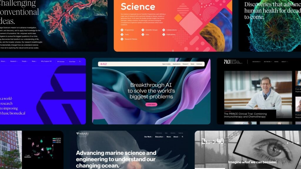
Parker Institute for Cancer Immunotherapy
Not all annual reports need all the bells and whistles of custom illustrations and new animations. Visceral worked with PICI to create an annual report in a web-friendly format using their existing styling that took their pdf report to the next level. Through the use of fullscreen photography and by organizing content in columns and sections, an otherwise lengthy PDF read was optimized for how people use the web, whether it is from their phone or from their desktop.
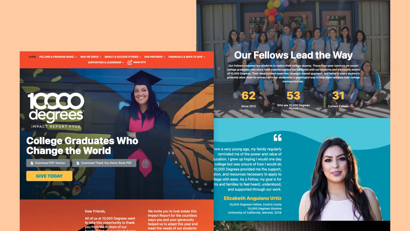
10,000 Degrees
This annual report makes use of widescreen imagery, scroll-triggered animation, colorful statistics and interesting hover effects to keep readers engaged. The different sections of the report are divided into pages with a corresponding menu at the top to avoid a lengthy scroll.
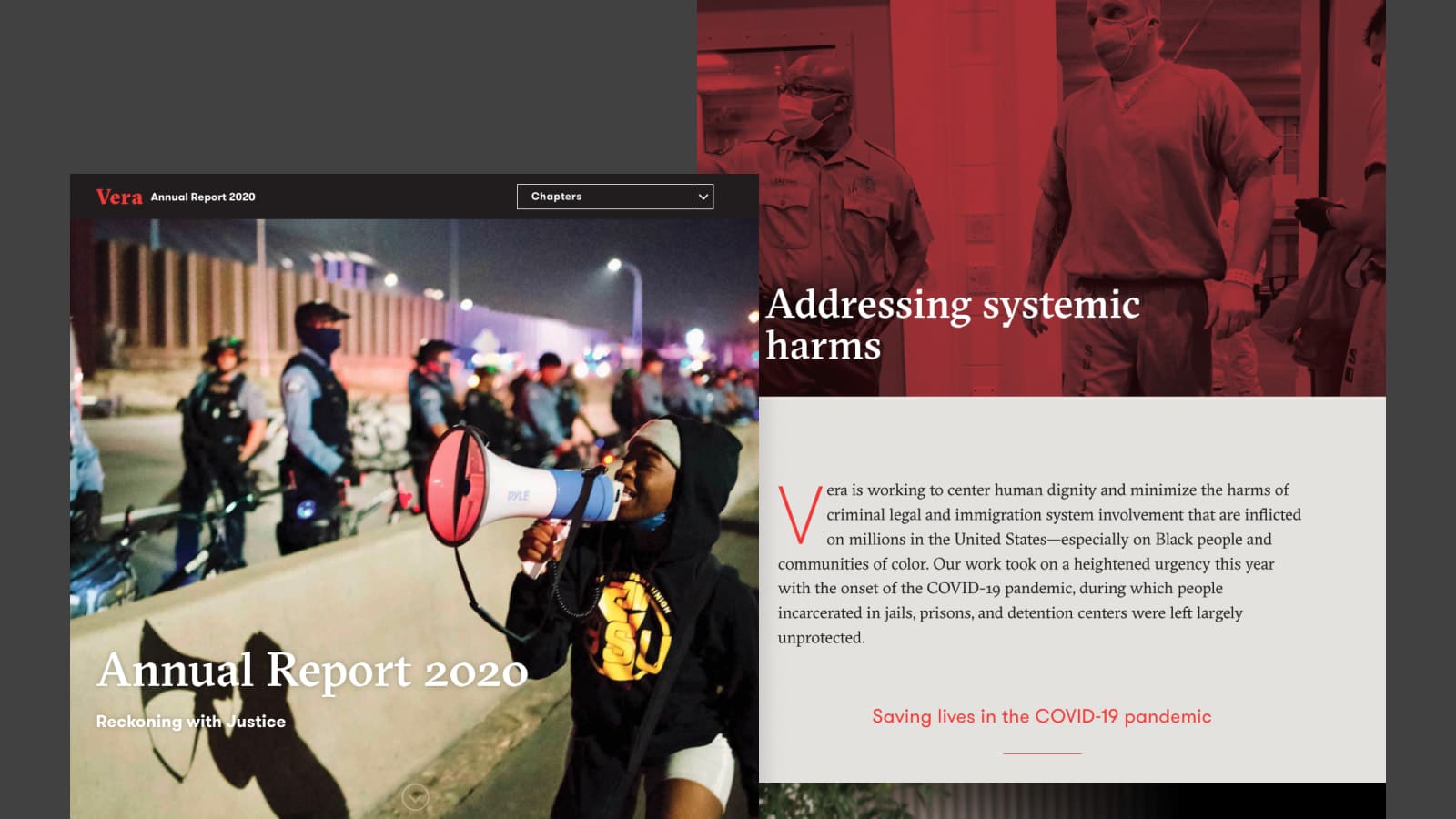
Vera
Neatly sectioned into chapters, Vera’s annual report uses fixed parallax effects on photos and thoughtful visual hierarchy to call out important pieces of information. The fixed navigation at the top has a dropdown menu with anchor links that make it easy to jump to different sections of the report.
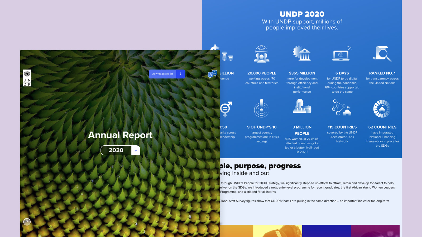
UNDP
UNDP’s 2020 Annual Report packaged their impact into bite-sized highlights complemented by custom iconography. What would otherwise be a text heavy report was brought to life with the use of color, infographics and illustrations that made scrolling down the report more engaging.
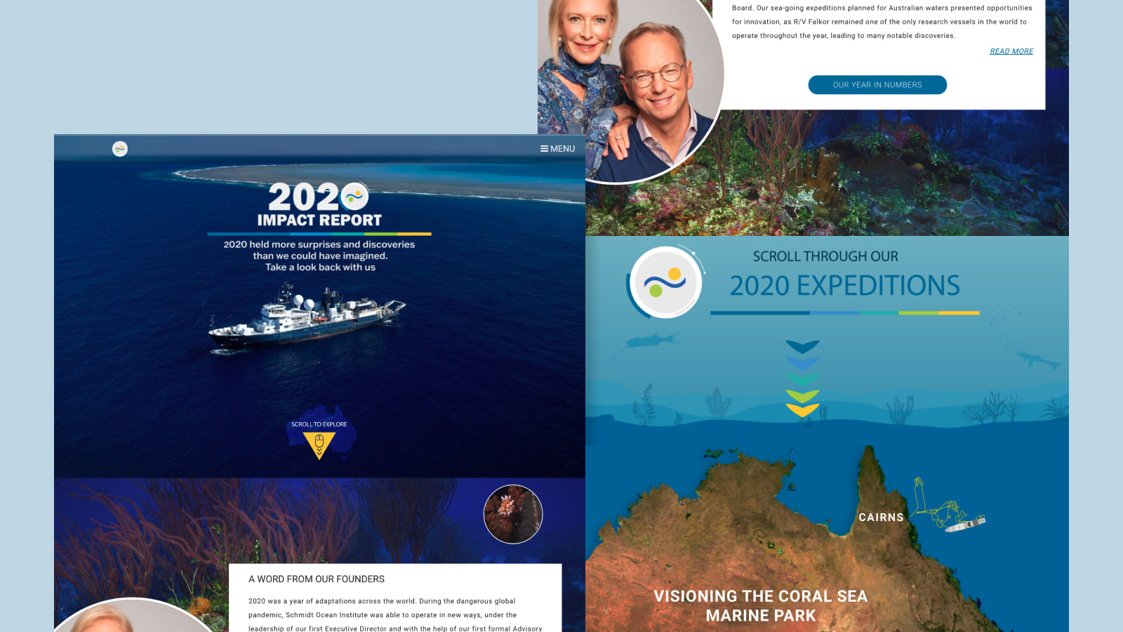
Schmidt Ocean Institute
The Schmidt Ocean Institute used their rich library of ocean photography to give depth and lead viewers into the different sections of their report. We also love their interactive map that makes use of scroll triggered animations, showing the expedition of their Falkor voyage and the amazing discoveries it made along the way.
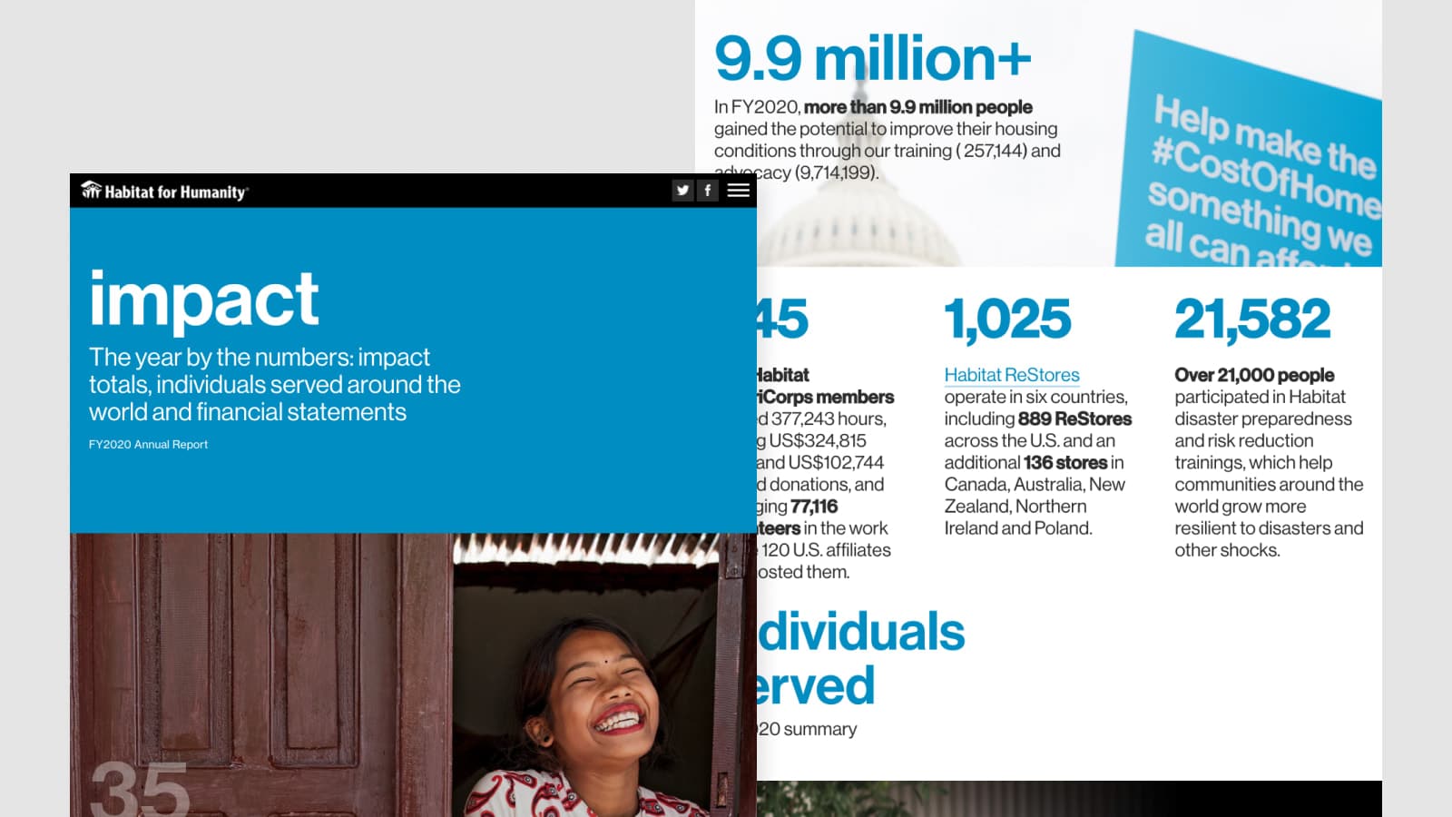
Habitat for Humanity
Habitat for Humanity’s clean design puts priority on readability. The simple yet effective use of bold weights, bright blue color and larger text size help call out key statistics and make scrolling through this responsive site a breeze to read. Other things we like about this site are their use of parallax on photos and the anchor linking navigation fixed to the top of the site.
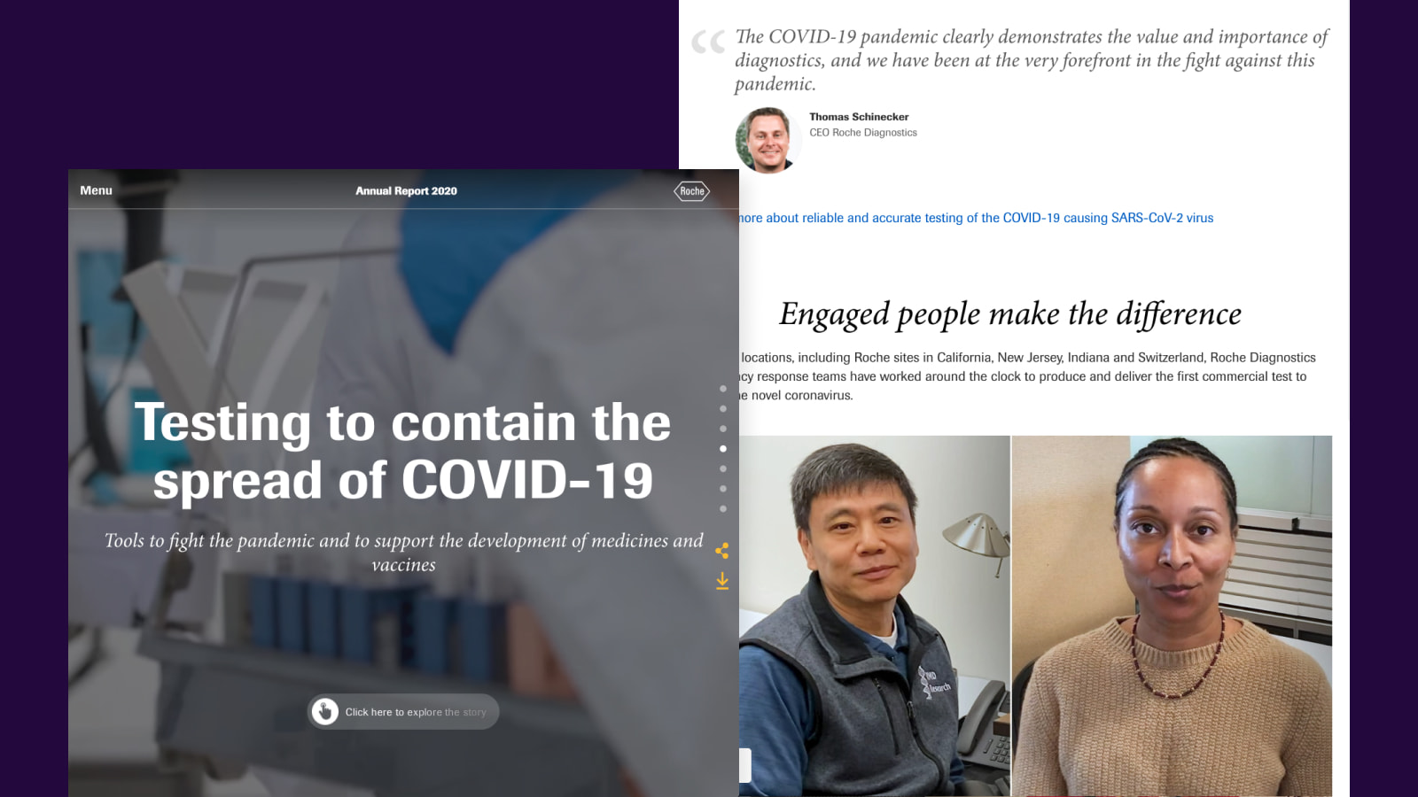
Roche
Another way to spice up a report is to get creative with button styles that allow for more user interaction. Roche made use of a right sidebar menu that is not obstructive and reveals upon hover. This clever use allowed the story and the video to still be front and center, while making sure the user can navigate through the report with ease.
In Summary
Inspire and showcase the impact your organization has made in the past year by creating a digital annual report. Through the use of interactive elements, responsive views, and analytics only available to digital sites, your past year’s efforts will surely not go unnoticed.
Ready to take your annual report to the next level? Contact us to learn more or get started.